Calligraphy design
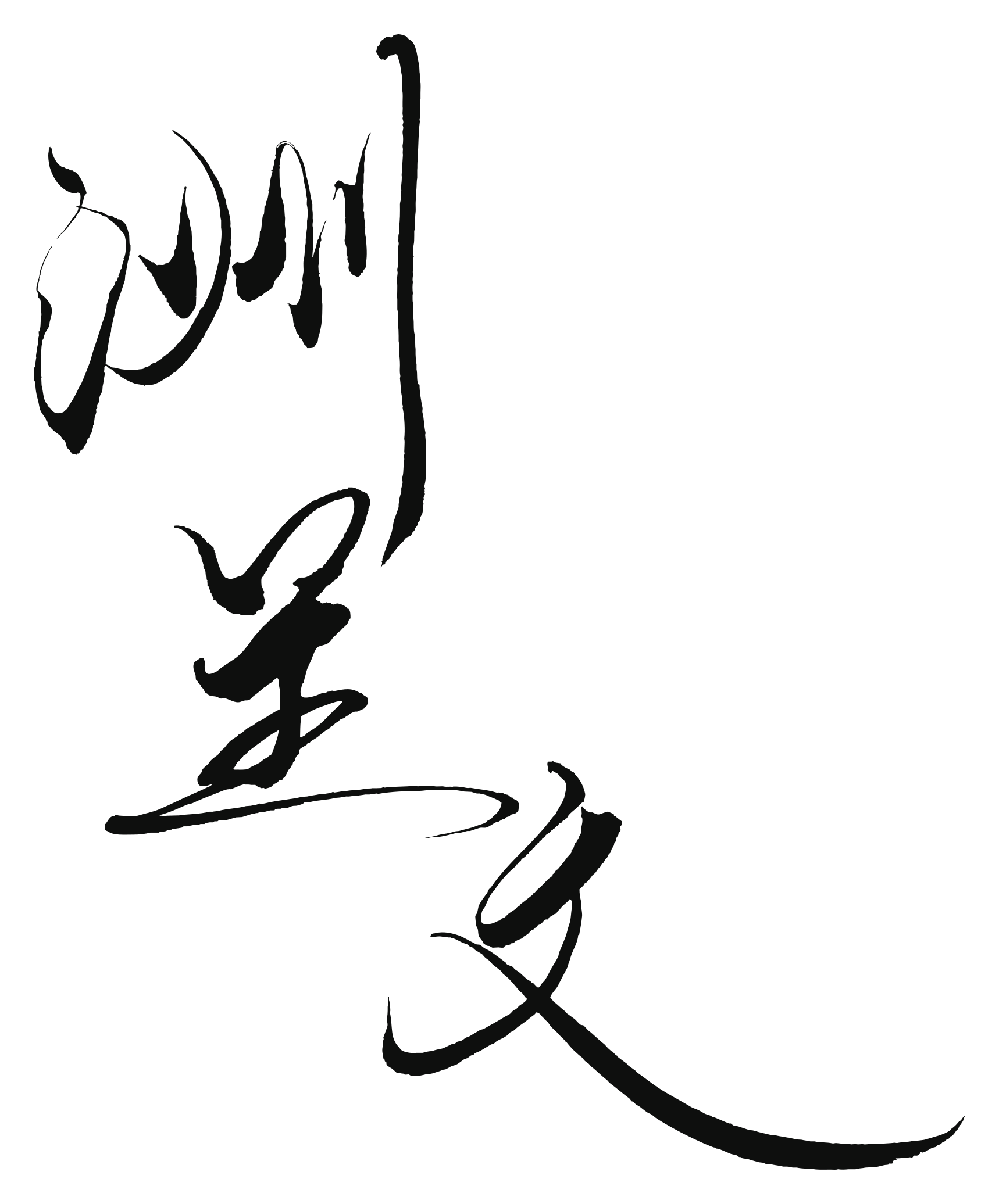
洲呈文
Original brush calligraphy for 洲呈文.
Created by SANTEN Design for 1791 Technologies in 2025, the identity combines 洲呈文 calligraphy, a family crest-style mark, a red seal, and the companion wordmark “The Palimpsestus.” Its documented design concept centers on weaving, interlocking forms, an archipelago of connected nodes, and an implied crown.
The visual identity was commissioned in 2025. SANTEN Design created the 洲呈文 calligraphy, the family crest-style logo, and the red seal; the presentation also included the companion wordmark “The Palimpsestus.”
Original brush calligraphy for 洲呈文.
Three continuous thread-diamonds interlock within a circle, carrying the commissioned ideas of weaving, trinity, an archipelago of connected nodes, and an implied crown.


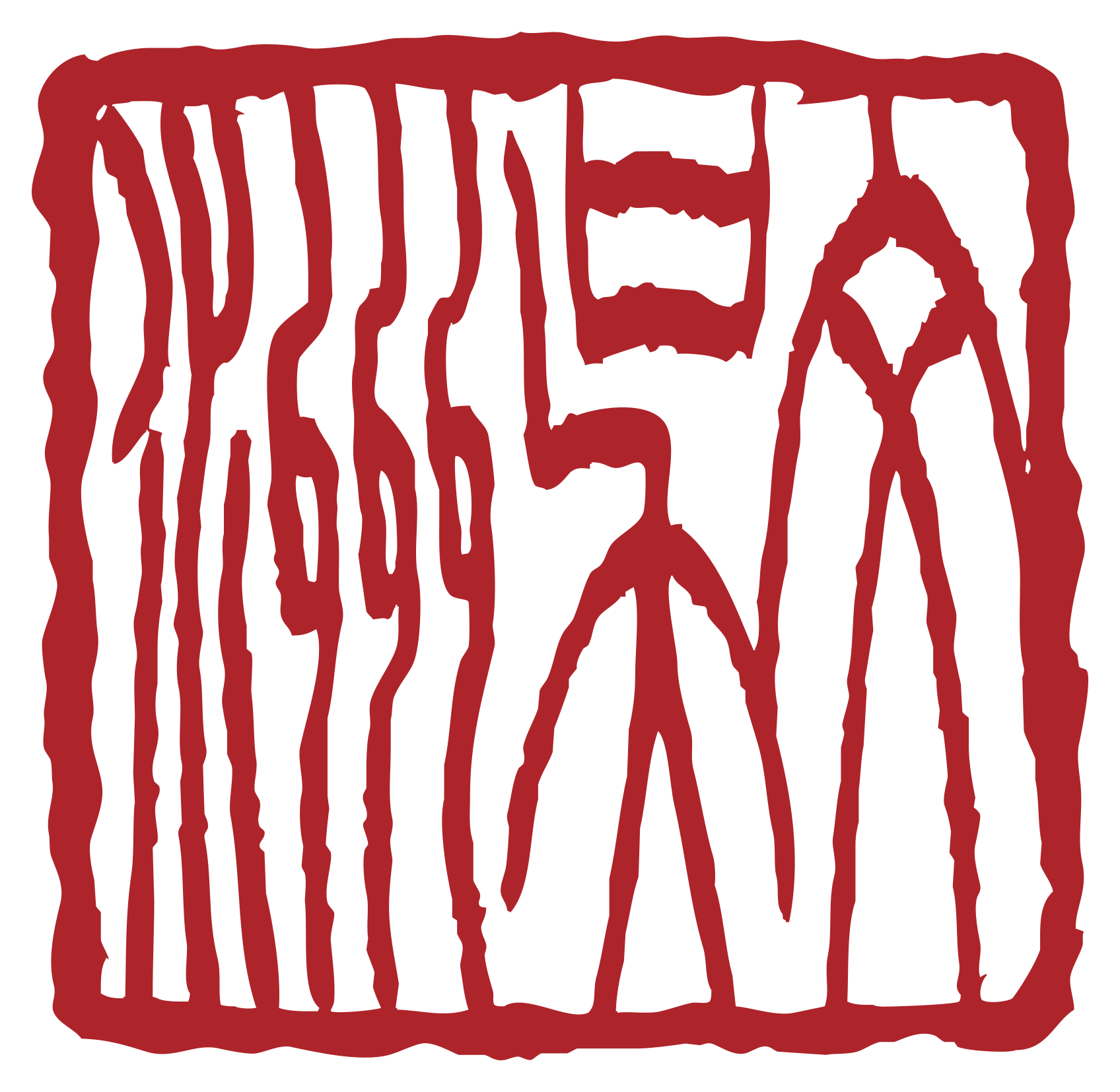
Red seal for 洲呈文.
The crest is built from three interlocking hishi forms, each drawn as a continuous looping thread, within an enclosing circle. The production brief connects the threads to weaving, the interlocking forms to a trinity and an archipelago of connected nodes, and the upper form to an implied crown.
The commission called the concept “Maru ni Mitsu-Ito-bishi” (三つ糸菱に丸), translated in the project materials as “Three Diamond Threads in a Circle.”
“Family crest-style” describes a contemporary mark inspired by Japanese kamon aesthetics. It is not a historical Weber family crest.
Project materials from 2025 gave the three characters a layered philosophical reading. That reading belongs to the history of the identity and predates the current Palimpsestus specification.
Interpreted in the 2025 material as a nodal world: islands, the relational sea between them, and traversal from one situated place to another.
Interpreted as revelation and rediscovery, with kintsugi as the image of repair that leaves the object's history visible rather than hiding the fracture.
Interpreted as pattern, culture, writing, and an underlying grammar discovered through connection.
This is an authored 2025 interpretation, not a standard Japanese compound reading and not evidence for later research claims.
Original production details and the 2025 identity manifesto are preserved below.
1. The Diamond Shape (Hishi). The original brief uses the hishi or diamond shape as the form naturally produced by intersecting weaving threads.
2. Three Interlocking Diamonds. Three forms interlock or overlap, invoking a trinity and a central nexus while radiating outward as an archipelago of connected nodes.
3. The Thread (Ito). Each diamond is formed by a continuous looping thread, making the weaver concept explicit and giving the mark motion and continuity.
4. The Implied Crown. The uppermost interlocking form creates an abstract crown, connecting to the project interpretation of Stephen / stephanos.
5. The Circle (Maru). The entire design is enclosed by a circle for balance, focus, and crest-style composition.
Aesthetic requirement. Clean, precise, balanced lines; legible and powerful even when reduced to a small icon.
The 2025 manifesto treated the three characters as a layered identity artifact: 洲 as an archipelago of being, 呈 as an act of revelation and visible repair, and 文 as the pattern or grammar made manifest.
It also described three layers of meaning: the project's spoken reading “Su-tei-bun,” the philosophical interpretation of the characters, and the English-origin personal layer connected to Stephen Weber.
The manifesto connected the name Stephen with crown/wreath imagery and Weber with the occupational meaning “weaver,” creating the project archetype of the “Crowned Weaver.” In that interpretation, the continuous threads of the crest weave relation into pattern.
Historical identity text from 2025; it is not evidence for later scientific claims.
Later Palimpsestus work developed concerns that overlap with parts of the earlier identity language. The overlap is part of the project's intellectual history; it does not validate the later architecture.
| 2025 identity artifact | Later Palimpsestus concern |
|---|---|
| Continuous thread | Ancestry, path, and continuity of warrant |
| Archipelago of nodes | Situated actors and relational structure |
| Visible repair / kintsugi | Historical standing and resistance to ancestral erasure |
| Underlying pattern / grammar | Governing grammar and structural recurrence |
| Interlocking plurality | Divergence, relation, and non-totalized perspectives |
| Layered identity / palimpsest | Provenance traversal and recoverable depth |
Interpretive comparison only. Palimpsestus claims stand on the specification, conformance record, and experiments.